Improving conversion in high-stakes finance
Overview
Fraction is an alternative lending product that helps homeowners access the equity in their home without needing to sell the property. It’s similar to reverse mortgage and HELOC products, but with incentives traditional products don’t offer.
The homeowner application was top of funnel for getting potential customers to our underwriting team. When I joined, we had created an application flow that had a lot of tradeoffs to maximize speed of launch. After a year of running v1, the completion rate was low, and it wasn’t obvious where people were falling off.

Who we're designing for
This wasn’t a typical fintech audience. The median age of users entering the funnel was 59. And about 70% of applicants were looking for debt consolidation. These were people trying to reduce pressure, not “explore options.” They wanted something that felt clear, legitimate, and worth finishing.
Problem
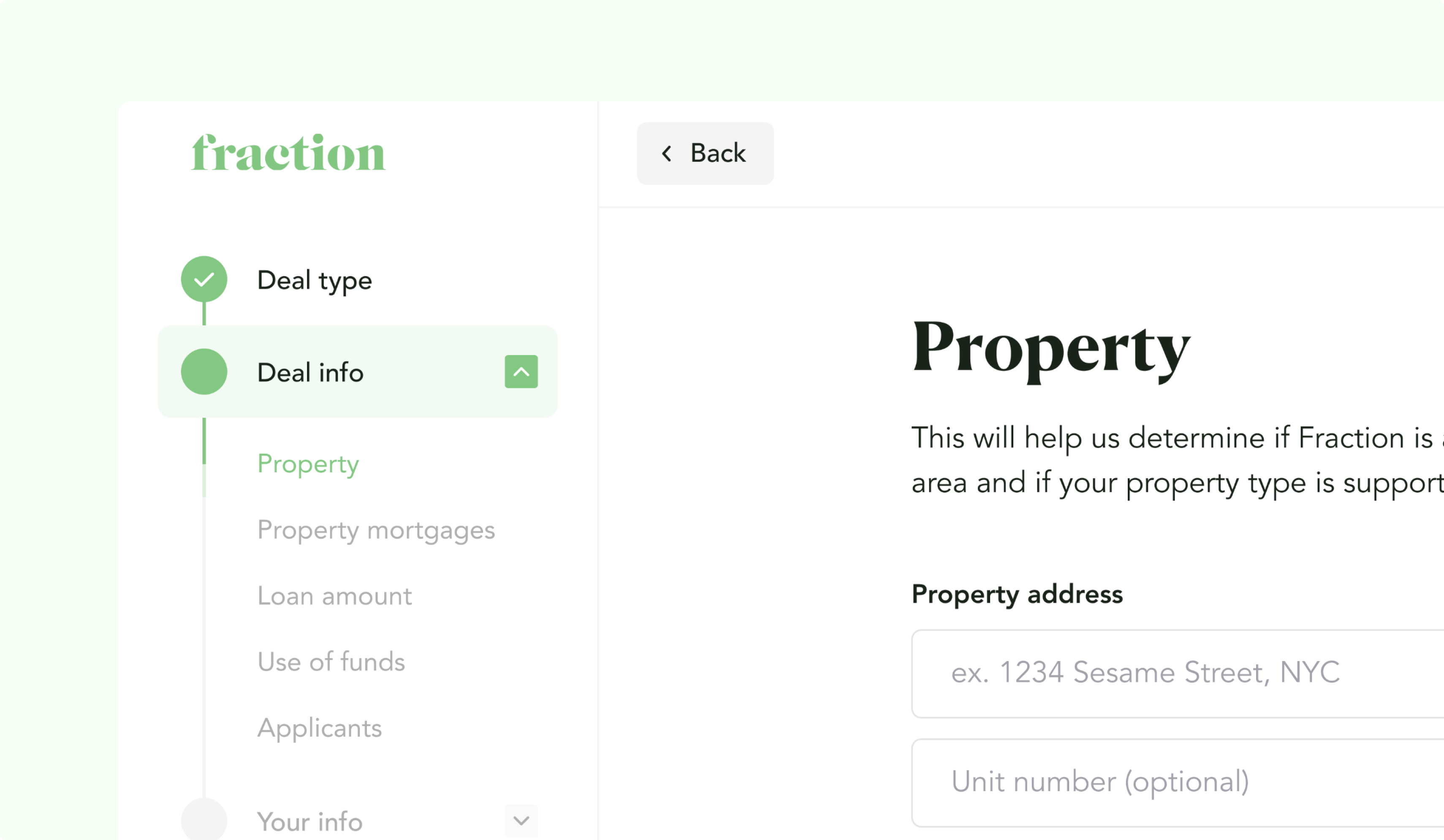
The first year showed a 13% completion rate for the homeowner application. When I looked at Hotjar, the drop-offs were evenly distributed. They weren’t clustering around obvious high-trust moments like entering financial information or submitting the form.That was the red flag. It suggested the problem wasn’t one scary step. It was fatigue and uncertainty across the entire flow.The initial form experience didn’t help. It was single-input, one question at a time. No way to save progress and return. Unclear how much was left. And the category list on the left didn’t really tell users what they were signing up for.
The culprits driving drop-off
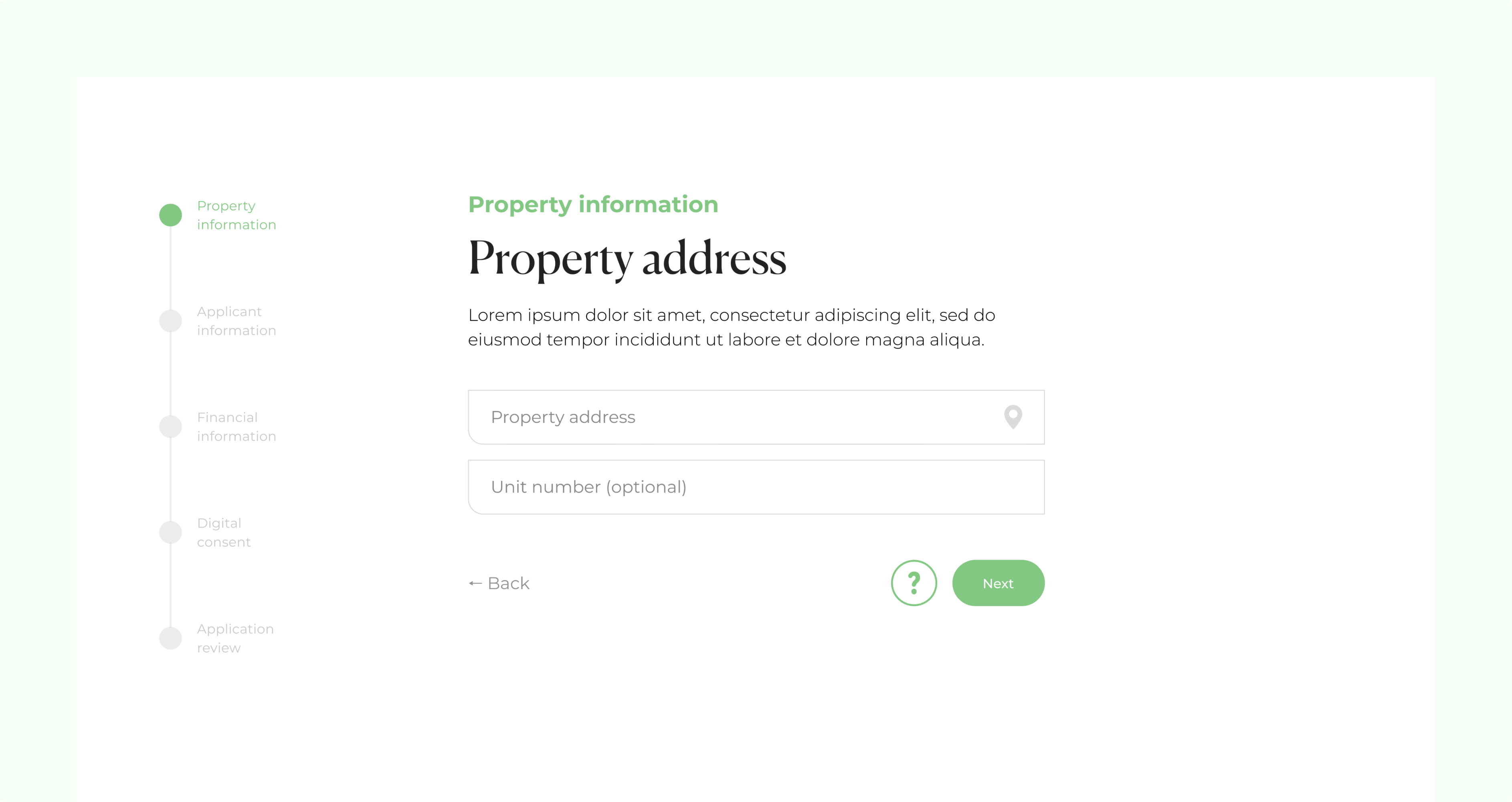
I had four suspects going in. The first was the single-input pattern. It added cognitive load because users couldn’t predict what was coming next, so every step felt like a new commitment and the form felt longer than it really was.
The second was how much manual entry we were asking for. Personal and financial details take time to type, and when the experience gives you no sense of momentum, it’s easy to feel that fatigue.
The third was clarity. The language leaned too heavily on jargon, there wasn’t much support built into the flow, and the product offering at the end didn’t feel like a real outcome people were working toward.
And the fourth was trust. The product was based someone’s home and debt, and the design language wasn’t strong enough to make the experience feel as legitimate and safe as it needed to be.
The plan
We turned those suspects into direct hypotheses:
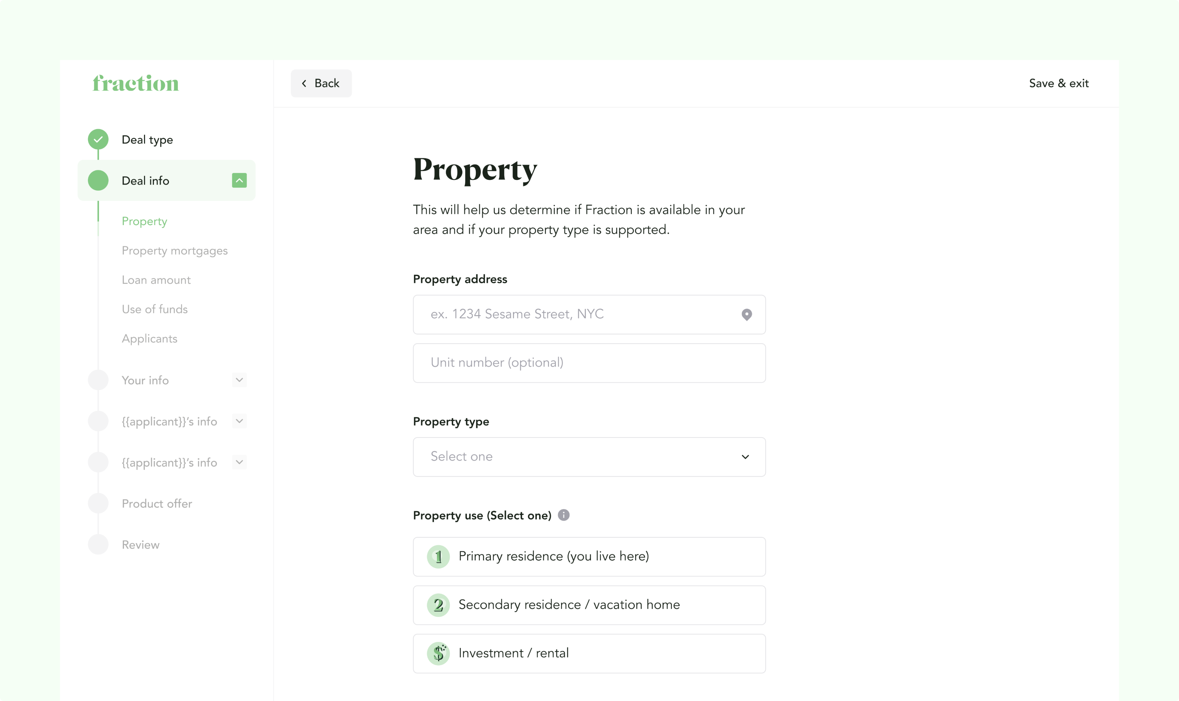
- Single input focus → group related inputs so progress feels real
- Manual fill → add third-party authentication to pre-fill where possible
- Absence of clarity → improve explanations and product offering details
- Lack of trust → raise the visual quality and reduce “sketchy form” vibes
Solution
We shipped a set of changes that all pointed in the same direction: reduce fatigue, reduce uncertainty, and make the end goal feel real.
Grouped questions and clearer structure
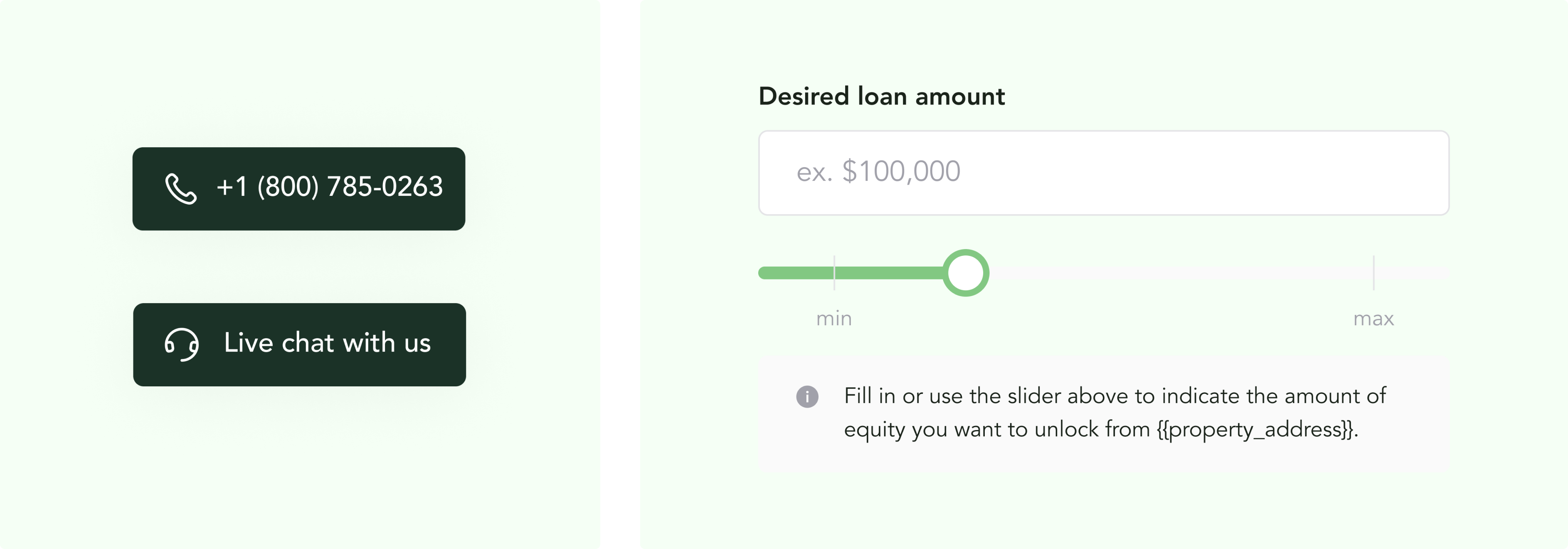
We stopped drip-feeding questions one by one and grouped them into clearer sub-categories. The point was momentum. Users should be able to glance at a section and understand what they’re answering.
We also added better progress and the ability to save progress and return later. This audience doesn’t always finish in one sitting, and there’s less pressure to complete the form in one go.
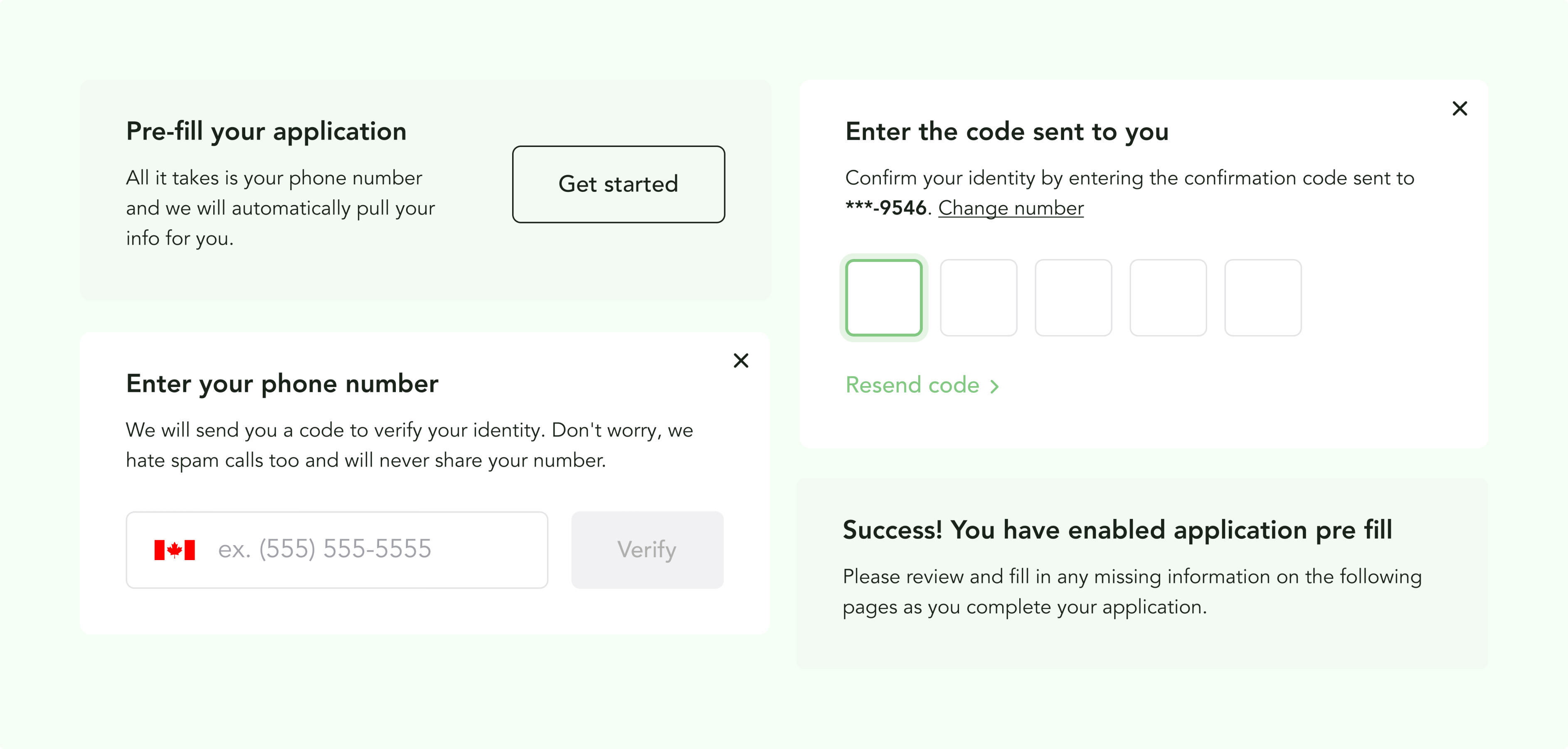
Autofill through a third-party authenticator
We introduced a path before starting the application that let users share a phone number so we could pre-fill a large chunk of personal details. It played a significant role in reducing the overall time to form submission.
Clearer language and support in-flow
We reduced jargon, added support affordances, and made it easier to get help without leaving the form. We added phone and live chat options so the experience didn’t feel like a dead end if someone got stuck.
A more tangible end goal
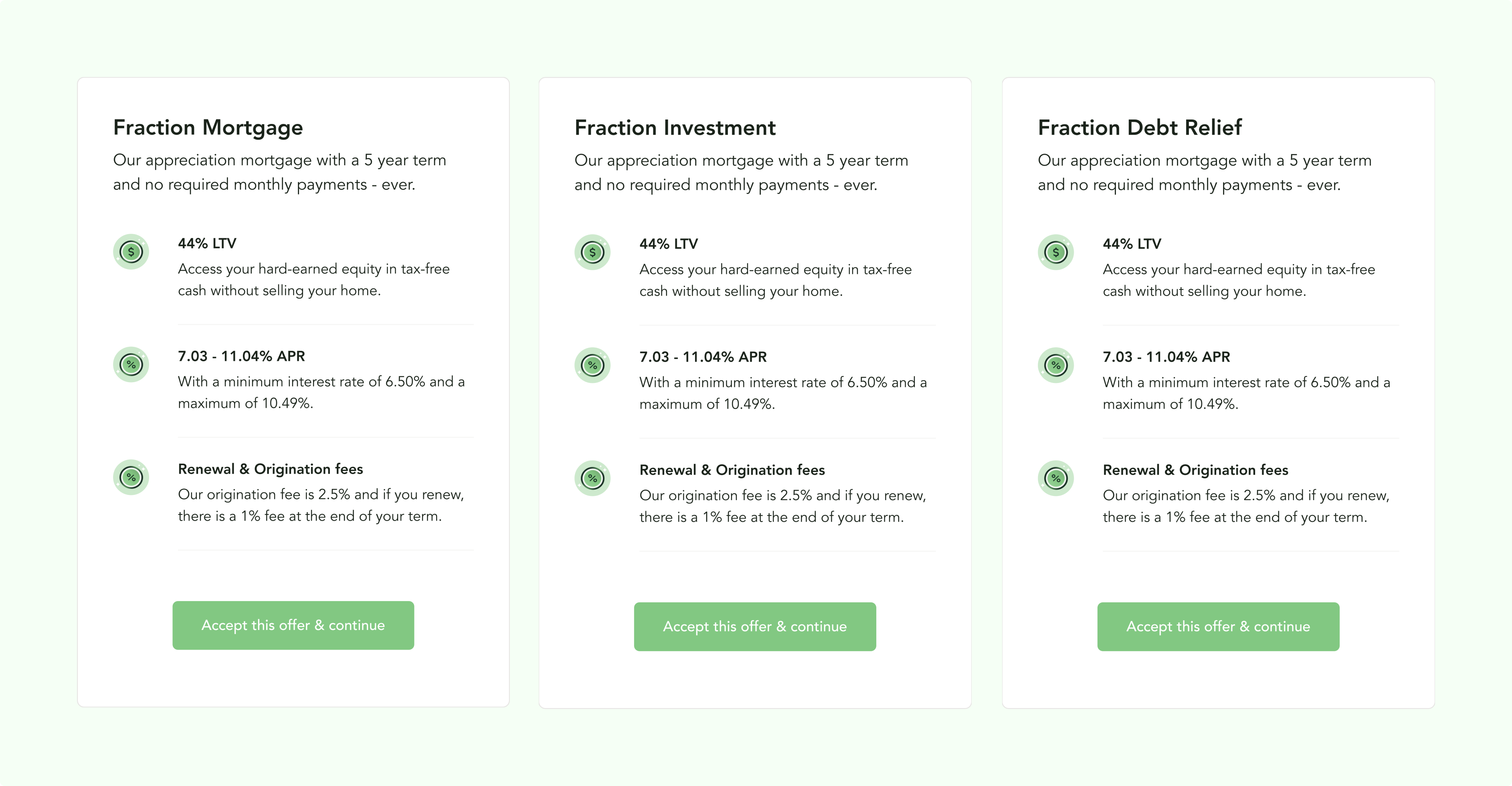
We introduced dynamic product “offerings” that updated based on submitted information. Even though we only had one product, the goal was to make the end of the form feel like you were working toward a personalized outcome, not just handing over data.
Visual upgrades and system cleanup
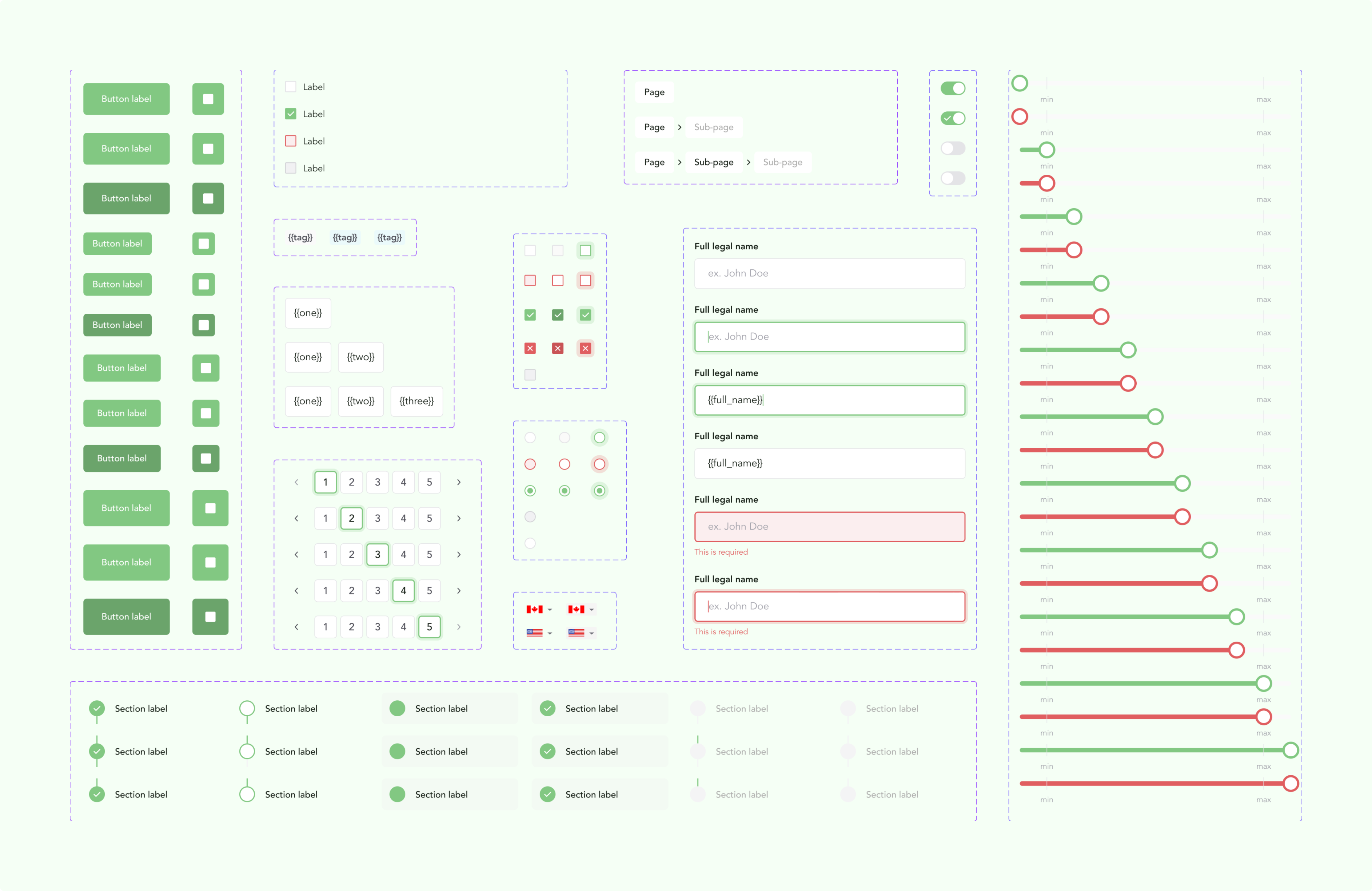
We raised the bar on the UI so it felt more trustworthy and consistent. We also revamped our design system as part of the work, since we were building internal and external tools the following quarter and needed a stronger foundation.
Outcome
We rolled the changes out with a split test and saw a 7% increase in completion rate, from 13% to 20%.The other result mattered just as much. Drop-offs stopped being evenly spread and started clustering around more natural decision points. That told us we removed a lot of “random fatigue” and got the funnel into a healthier shape.There was still work to do, but at least we knew where to target next. The highest-risk moments were clear: submitting, entering financial details, and understanding the product well enough to commit.
My role
- I diagnosed the drop-off pattern using Hotjar and funnel data, and framed the problem as form fatigue rather than a single broken step.
- I led the redesign strategy and execution as design manager, working with a junior designer I had hired.
- I partnered closely with engineering on implementation details like save-and-return, question grouping, and the third-party pre-fill flow.
- I helped define how we’d measure success, ran the split test, and used the results to decide what to focus on next.