Usability improvements for meetings
Overview
Topicflow is an AI-powered performance management product built around continuous feedback. The meeting page is where teams track agendas and notes, and where we surface things like AI recaps, transcripts, and insights. It’s also where the notetaker bot lives, which is one of the main ways we capture meeting data. This project focused on one basic issue: the controls for the meeting page were hard to find and unclear to use, so people weren’t using them.
Problem
The core controls (join, notetaker settings, permissions, sidebar, layout toggles) were tucked into a thin top bar and shown as icons only. No labels. No onboarding. No hierarchy. Most users didn’t even realize they existed.
That caused a bigger issue than “the UI is confusing.” It slowed adoption of one of Topicflow’s most important workflows. If people don’t use meetings, we lose the data that powers summaries and the rest of the product.

What we were trying to fix
This wasn’t about redesigning the meeting page. It was about making a few actions obvious and making system states visible. People needed to answer simple questions without thinking:
- Where do I join?
- Is the notetaker running?
- What can I do with the notetaker?
- What are the permissions for this meeting?
Scope and constraints
This project was a two week push. We had to improve discoverability without turning the meeting page into a toolbar. We also had to be careful about screen space and smaller layouts since the meeting content itself still needed to stay primary.
Solution
We got to the final design through a few iterations. Each version solved part of the problem and exposed the next one.
Attempt 1: Fixed bottom bar
The first move was the obvious one. Put the controls somewhere you can’t miss. We pulled them into a fixed bar at the bottom of the meeting page. It worked in the most literal sense. People noticed the controls.
But the bar felt heavy. It pulled focus away from the meeting content, especially on smaller screens. And we still had an understanding problem. Icon only buttons are easy to see and easy to misunderstand. Labels helped, but then the bar started to feel bloated. So visibility improved, but usability didn’t improve enough.

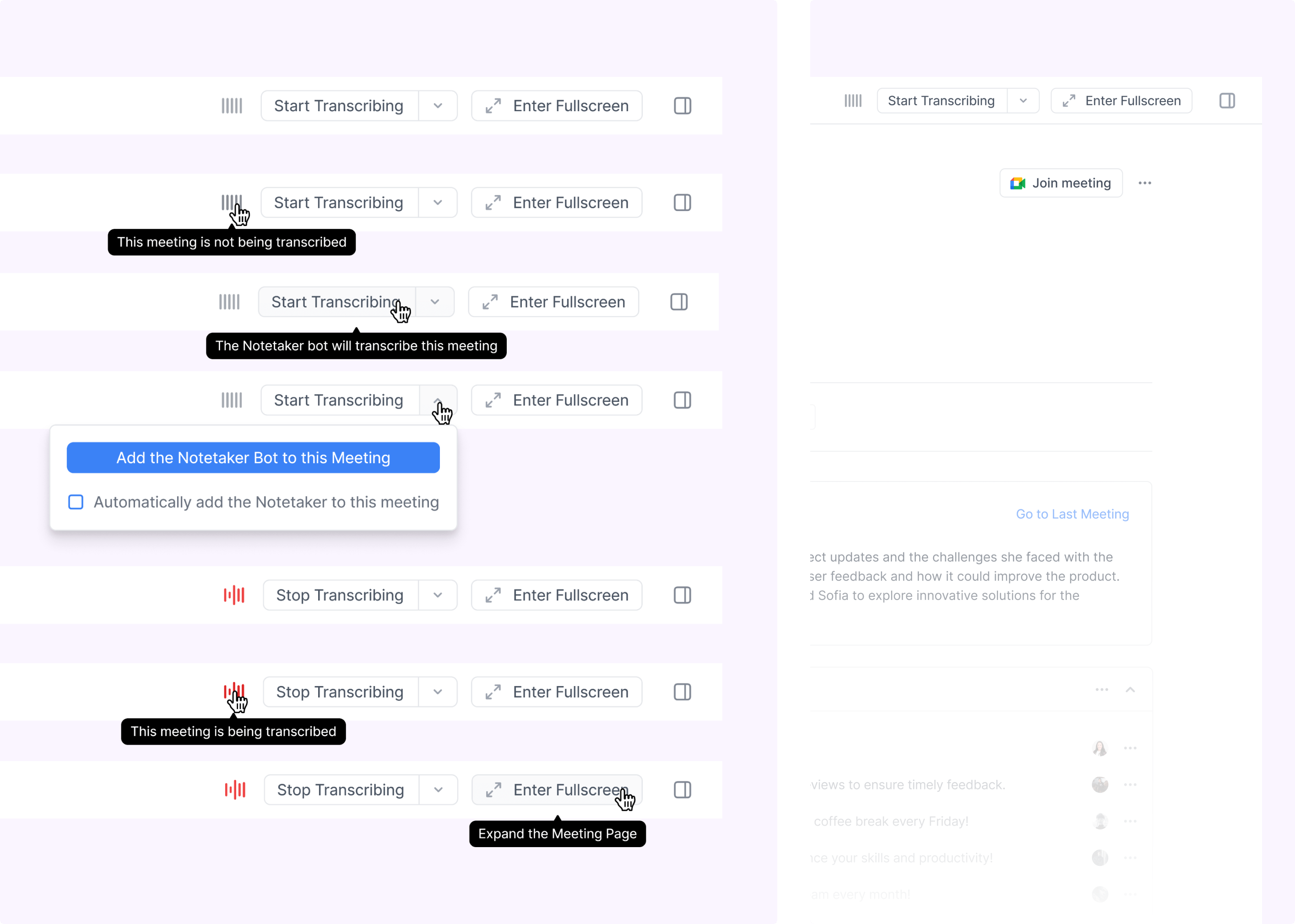
Attempt 2: Labeled top bar with nested actions
Next we brought the controls back to the top, added labels, and nested some actions into dropdowns to keep things tidy. It was cleaner and more spacious.
But this version still hid key states. The notetaker status was not obvious enough. Some important actions were buried. We had technically made the UI more “organized,” but users still weren’t confident about what was happening and what each control would do. So we’d fixed a layout problem, but not the clarity problem.
.png)
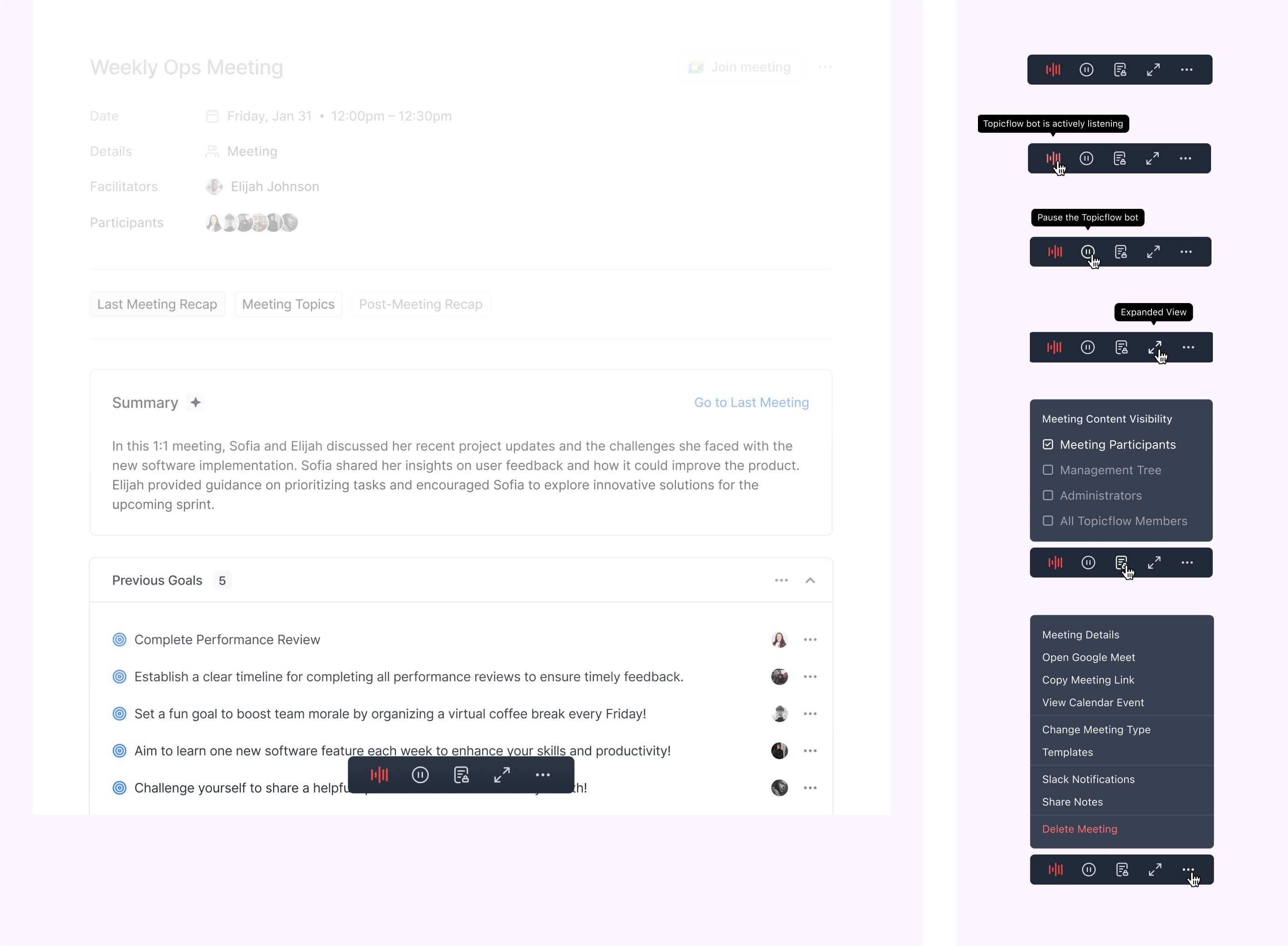
Final version: Simplified top bar, grouped actions, exposed states
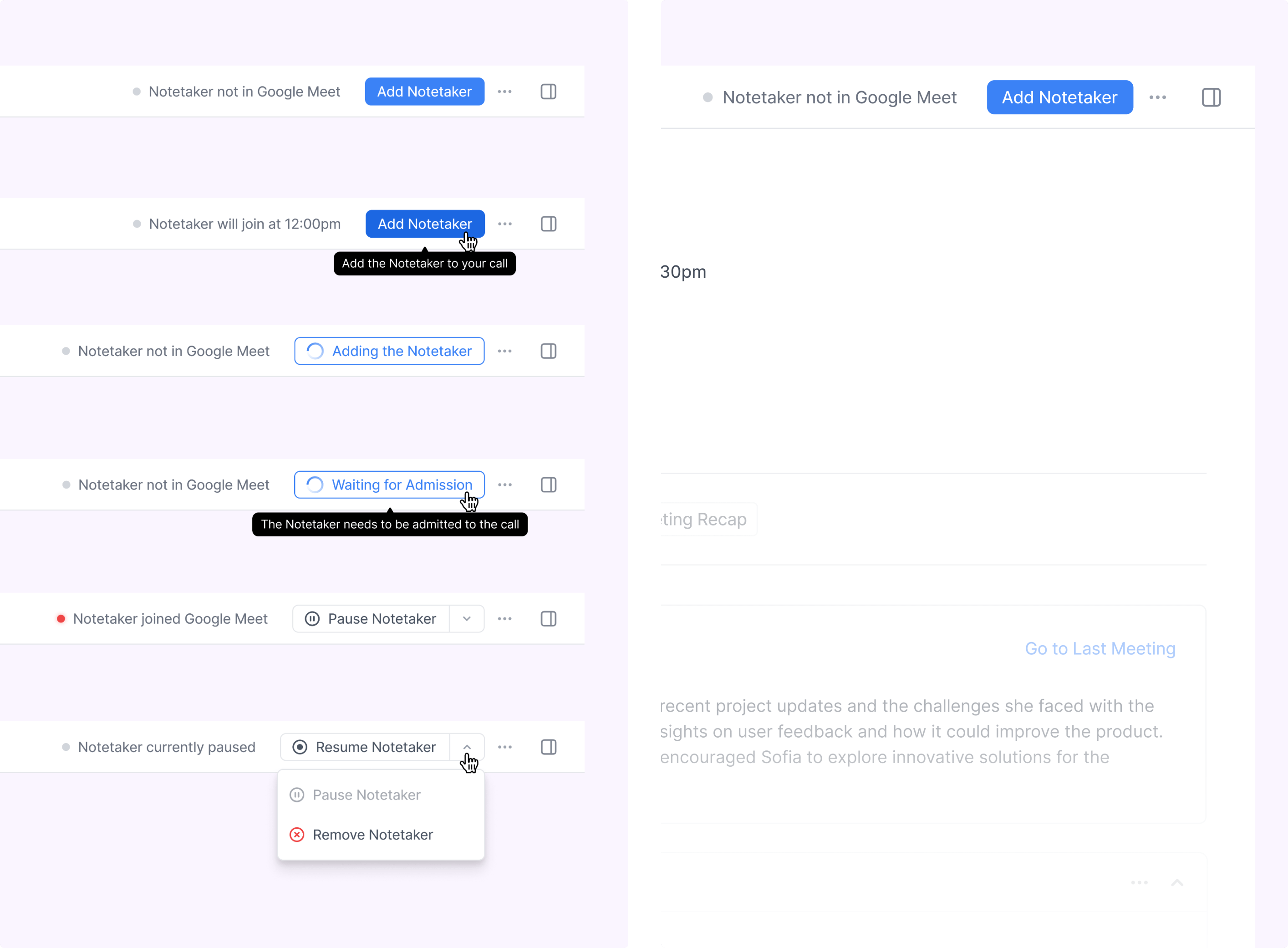
The final version leaned into clarity over minimalism. We grouped actions by what they affect. Meeting level actions moved into the meeting details area. Notetaker related actions stayed up top, since those are the ones people need in the moment. We also stopped relying on hover and icons to carry meaning. Important controls were labeled directly, and key system states were visible so users always knew what was happening.
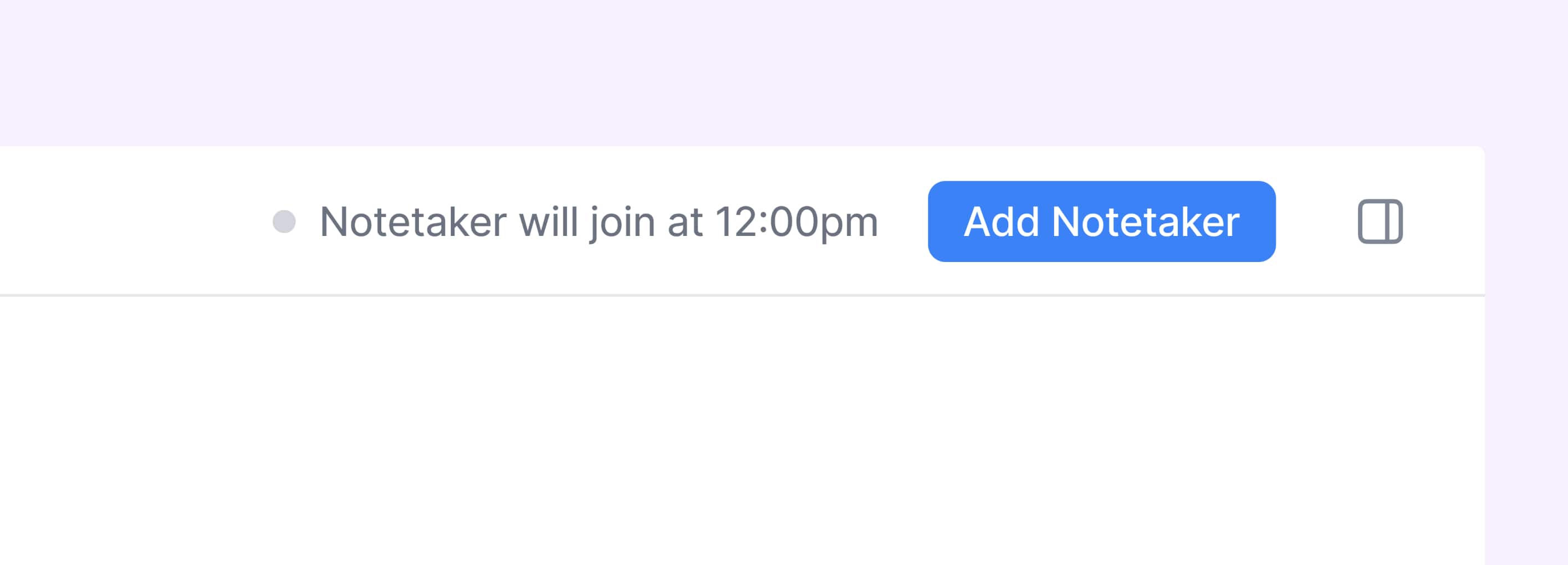
Another detail that mattered: we made it easier to add the notetaker to a meeting even if it hadn’t been enabled ahead of time, so the workflow didn’t break when someone was late to setup. This version kept the page clean, but it felt more self explanatory.
.png)
Results
Two weeks after launch, we found the redesigned controls reduced the confusion that had been blocking existing adopters. Internal testing showed faster task completion. In customer calls post launch, users could describe what each control did without prompting. We also saw fewer support tickets about how to use meeting features.
This project however did not help with overall engagement for our meeting tool. Topicflow still didn’t provide the right value to cause migration from existing meeting tools. This was a big problem for us since meeting data is a rich resource for our AI to provide insight to managers and push the value of continuous feedback with a tool like Topicflow.
Exploration into a redesigned meeting tool is currently ongoing.
My role
- I worked with our customer associate to decipher why our meeting functionality had low engagement.
- I documented the PRD in Linear and maintained a PM role to push the project forward.
- I owned the interaction model for meeting controls, including where actions lived, how they were grouped, and how states were exposed.
- I drove the iteration cycle across three designs, using each attempt to learn what still felt hidden or confusing.
- I designed the final top bar system with labels and clearer hierarchy so users could find and understand controls without guessing.
- I partnered with engineering on implementation details like responsiveness, clutter control, and notetaker setup edge cases.
- I reviewed early builds, validated the behaviour against the intended flows, and helped shape final polish before release.